November 7, 2025
The Hidden Psychology of Color Haze in Product UI

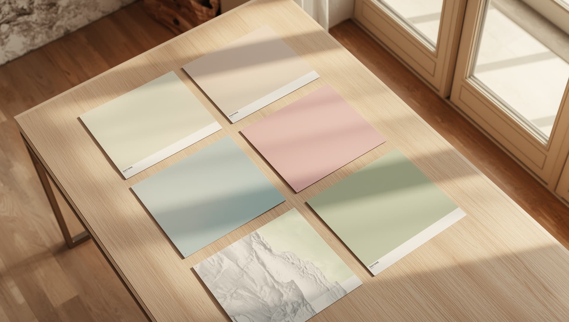
Pastel haze backgrounds do more than look pleasant—they quietly shift user perception and emotional state.
Research in visual cognition suggests that:
- • Low-contrast hues reduce perceived friction
- • Soft noise patterns improve readability by breaking uniform color fields
- • Warm-to-cool gradients increase perceived depth, giving interfaces a modern sense of space
We've seen these principles play out in real product teams. Designers consistently report that replacing flat color blocks with pastel haze textures results in:
- • longer session times,
- • improved onboarding completion,
- • and better first-impression metrics for landing pages.
At Texaria, our color haze surfaces are built with these psychological insights in mind—each one tuned for clarity, calm, and premium product feel.